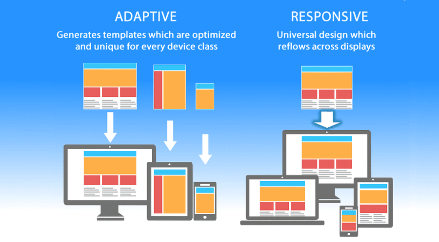
Responsive web design is an approach to creating websites that ensures they look and function well on a variety of devices, including desktop computers, laptops, tablets, and smartphones. With the increasing use of mobile devices to browse the internet, it’s more important than ever to make sure your website is responsive.
In the past, creating separate websites for different devices was a common practice. However, this approach can be costly and time-consuming, and it can also lead to inconsistencies in the user experience across devices. Responsive web design solves these issues by using a single codebase and adjusting the layout and content based on the size and orientation of the screen.
The key principles of responsive web design include:
- Flexible layouts: Rather than using fixed widths, responsive design uses relative units like percentages to allow content to adapt to the screen size.
- Media queries: These allow different styles to be applied to different screen sizes, ensuring that the website is optimized for each device.
- Fluid images: Images are scaled based on the size of the screen, ensuring that they don’t become pixelated or distorted.
Responsive Web Design
Responsive design offers a number of benefits for website owners and users alike. For website owners, responsive design means that they only need to maintain one website, which can save time and money. It also means that their website will be accessible to more users, as it will look and function well on a variety of devices. This can lead to increased engagement and conversions.
For users, responsive design means that they can access the same content and features on any device, without having to zoom in or out or navigate through different versions of the website. This can lead to a more consistent and enjoyable user experience.
There are also some potential drawbacks to consider when implementing responsive design. It can be more challenging to create a cohesive design that works well across different screen sizes, and there may be some performance issues to address. However, with careful planning and optimization, these issues can be minimized.
In conclusion, responsive web design is an essential approach for any website owner who wants to provide a consistent and accessible user experience across devices. By using flexible layouts, media queries, and fluid images, website owners can ensure that their website looks and functions well on any device. With the increasing use of mobile devices to browse the internet, responsive design is no longer an option but a necessity for any website owner who wants to succeed in today’s digital landscape.